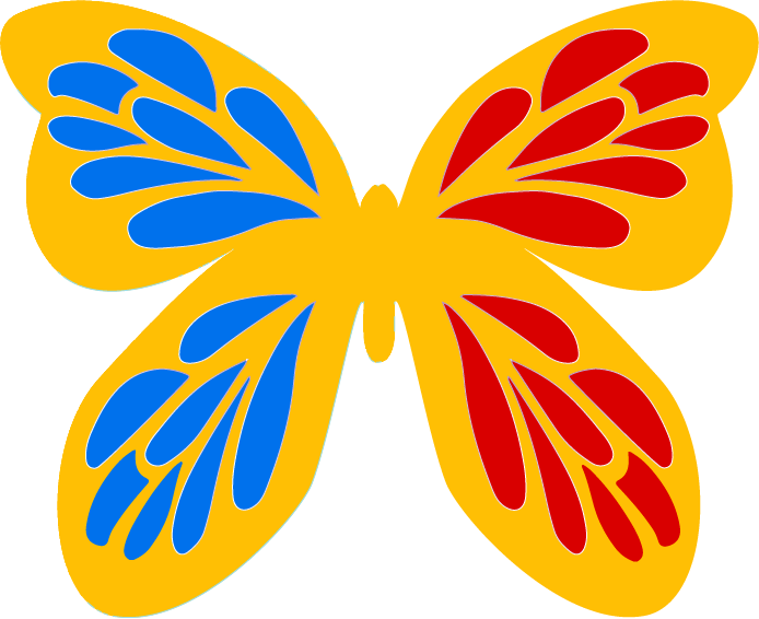
For this project, I invented a company, Sunskin, and a logo, which I created in Adobe Illustrator. The flyer is promotional but also gives advice on skincare in the summer. Altogether, I used three different vector graphics, including two different logos and the teal background layer. I created all the vector graphics in Adobe Illustrator. In Adobe Photoshop, I used layer masks around the photographs. The white cream around the bottom two pictures is actual sunscreen I snapped a photo of and edited in Photoshop.
I had several problems in creating my flyer. My biggest challenge was getting the text box to work correctly. All of my paragraph text went on one extremely long line. To fix this problem, I ended up resetting all the settings. Another issue was the eyedropper tool. For some reason, sometimes my eyedropper tool in Photoshop gives the hex numbers for gray, even though I selected an actual color. Unfortunately, this issue still hasn’t completely gone away. I looked up the issue online and it seems some other people had the same problem–but that there is not a definitive answer. However, occasionally the eyedropper tool does work though.
My color scheme emphasizes the complementary colors, blue-green and red-orange. The blue-green color of the vector paper is based on the water in the background photograph. Originally, this flyer was one of three comps, or variables, of the flyer. I believe this one looks the best because of the repetition of the complementary colors. Originally, the bottle of sunscreen shown in the lower-right-hand corner was a different color. I used a layer mask to change the color to red-orange. This red-orange color matches the color in the logo. I also used a vector mask to alter the color of the woman’s hat to match the orange melons.

